实现Button组件
说明
写ui组件最重要的就是UI和用户易用,别人看起来要觉得好看,并且使用起来非常简单;因此先从ui开始然后考虑怎么使用简单,然后再去实现
1、组件UI及功能分析#
当我们刚开始做一件事情的时候,我们可能没有什么头绪,此时我们可以找一些已经有的内容进行参考,先学会怎么做再去做的不同做的更好 比如说组件的UI我们并不是UI设计师,可能并不能做好组件的UI设计,此我们就可以去参考其他的组件库Element、Ant Design、iView,那么就去看看你想要的ui吧
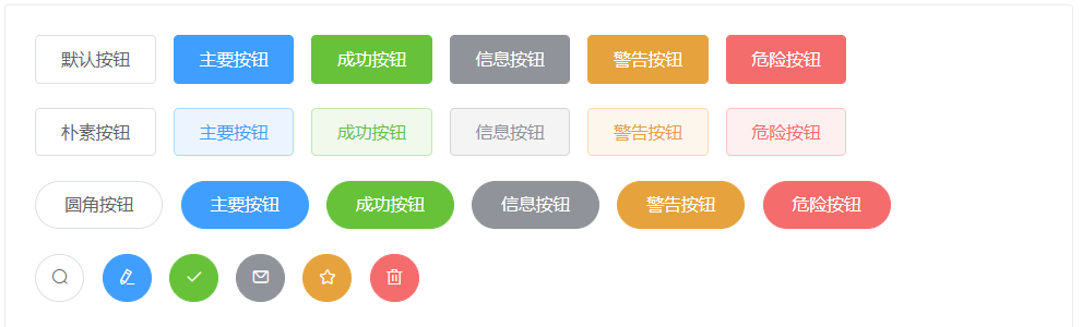
我们以element ui为例,我们要实现 主题颜色、圆角、禁用、图标按钮、loading等
2、基本实现#
不管怎么样我们要先让一个按钮在页面中显示出来
通过.vue单文件组件的方式创建button.vue文件,即 Button组件 ,在该文件的<template></template>中添加<button>按钮</button>标签,然后再在其他文件中引入并注册后使用,运行即可看到一个按钮
基本思路
组件的核心其实还是对原生标签的操作,只不过是我们在编写组件的时候,将一个复杂的功能在组件内部实现,然后暴>露一个简单的接口或者指令,当被人使用组件的时候就可以通过简单的接口或则指令轻松达到复杂目的
组件开发的过程中我们应该充分利用原生的特性,我们的input组件是基于vue的因此我们要充分利用原生即vue对button的支持和特性因此我并不建议使用其他的标签代替button标签
2.1、创建j-button.vue单文件组件#
(1)、在src目录下创建j-button.vue文件 我们这里将使用css预处理器scss来编写样式所以需要先安装scss
npm install sass-loader sass --save-dev<template> <button class="jh-button">按钮</button></template>
<script>export default {};</script>
<style lang="scss" scoped></style>2.2、注册使用j-button.vue组件#
(1)、将Vue和button组件的引入入口文件并全局注册button组件
/src/index.js import Vue from 'vue'+ import JButton from './j-button.vue'+ Vue.component("j-button", JButton) new Vue({ el: "#app", data:{ msg:"你好" } })(2)、在src下的模板文件中使用组件
/src/index.html <body> <div id="app"> {{msg}}+ <j-button></j-button> </div> </body> 2.3、安装loader配置webpack#
(1)、安装解析vue的loader并配置webpack 安装webpack解析vue、scss等loader
npm i -D css-loader style-loader sass-loader vue-loader const path = require('path'); const HtmlWebpackPlugin = require('html-webpack-plugin');+ const VueLoaderPlugin = require('vue-loader/lib/plugin') module.exports = { entry: { app: './src/index.js', }, plugins: [ new HtmlWebpackPlugin({ //复制'./src/index.html'文件,并自动引入打包输出的资源文件(js/css) template: './src/index.html', }),+ new VueLoaderPlugin() ], output: { filename: '[name].bundle.js', path: path.resolve(__dirname, 'dist'), clean: true, }, module: { rules: [+ {+ test: /\.vue$/,+ loader: 'vue-loader'+ },+ {+ test: /\.s[ac]ss$/i,+ use: [+ // Creates `style` nodes from JS strings+ "style-loader",+ // Translates CSS into CommonJS+ "css-loader",+ // Compiles Sass to CSS+ "sass-loader",+ ],+ }, ] },+ resolve: {+ alias: {+ 'vue$': 'vue/dist/vue.esm.js' //内部为正则表达式vue结尾的+ }+ } }; important
到此运行:npm run dev 应该可以在浏览器看到一个按钮和你好
3、自定义button组件文字#
3.1、需求#
以上我们发现使用组件的时候并不能自定按钮的文字,因此我们要实现自定义的文字
3.2、自问自答(分析)#
Q: 使用button组件时怎样才能更方便自定义文字呢?A: 肯定是和原生的button一样写在中间就行
Q: 那么vue怎么向子组件中插入自定义的元素呢?
A: slot插槽,在子组件中定义一个slot即在使用组件的时候在组件标签中插入的内容会自动替换掉子组件中插槽占据的位置
3.3、实现#
通过以上问答基本上就已经很清楚了:即在子组件的button标签中添加<slot></slot>插槽标签,然后再使用组件的时候在组件标签之间添加文字,该文字就会自动占据子组件中插槽的位置而达到自定义文字的目的
<template> <button class="jh-button">+ <slot></slot> </button> </template> <body> <div id="app"> {{msg}}+ <j-button>再此就可以自定义按钮的文字了</j-button> </div> </body>4、实现不同主题按钮#
4.1、需求#
我想要我的按钮拥有不同的主题(不同主题有不同颜色等样式),让使用者可以选择不同的主题样式
4.2、自我问答(分析)#
Q: 在对原生Button标签的操作时我们一般通过什么来设置颜色等各种样式?A: 通过css样式,为标签定义class属性添加类选择器,在选择器中添加各种样式
Q: 因为我们需要预设多种主题,那么vue有哪些方式可以动态修改该元素的样式呢?
A: 通过vue的v-bind指令可以动态添加元素的calss属性和style属性(我想你应该很了解vue的v-bind的用法了)
Q: 那么我们怎么让使用该Input组件的人方便快捷的的设置不同的主题呢?(也就是怎么从外面父组件告诉里面子组件设置主题呢?)
A: 此时我们就要想到vue的父子组件中的传值,通过props就可以传递一个值给子组件(我们要写的Button就是一个子组件)
4.3、实现#
通过以上问答基本上就已经很清楚了:即我们通过v-bind:calss={[j-button--${type}]: true}在组件内绑定元素的类选择器,将选择器名称变量定义为组件的props中type,然后用户在使用该组件的时候通过type="primary"传入想要的预设主题,最后组成不同的类名即就是不同的样式
<template> <button class="jh-button" + :class="{+ [`j-button--${type}`]: true+ }"> <slot></slot> </button> </template> <script> export default {+ name:"JButton",+ props:{+ type:{+ type:String,+ default:"default",+ validator:function(value){+ // 验证用户输入的值+ }+ }+ } }; </script> + <style lang="scss" scoped>+ .j-button--primary{+ + }+ .j-button--error{+ + }+ </style> <body> <div id="app"> {{msg}}+ <j-button type="primary">再此就可以自定义按钮的文字了</j-button> </div> </body>4.4、拓展#
通过以上方式即可以设置:是否禁用、圆角等
5、添加button组件图标#
5.1、字体图标库iconfont.cn#
阿里巴巴 iconfont.cn 图标库中查找想要的图标
(1)、把想要的图标保存到我的项目》选中symbol》选择更多操作》选择编辑项目》FontClass/ Symbol 前缀》输入 -i 进行命名统一风格》
(2)、选择批量操作》全选》批量去色
(3)、点击查看在线链接》复制生成的链接》将链接通过<script>在模板html文件(./src/index.html)中引入
<script src="http://at.alicdn.com/t/font_1749970_f8wt8gcia9.js"></script>(4)、字体图标引入优化
取消第三步中引入的<script></script>标签》将以上复制的连接载浏览器打开at.alicdn.com/t/font_1749970_f8wt8gcia9.js再复制打开的代码》再src目录下新建svg.js文件将复制的代码粘贴后保存》
5.2、字体图标组件#
(1)、创建j-icon.vue文件并导入svg.js
<template>  <svg class="icon" aria-hidden="true">    <use :xlink:href="`#i-${icon}`"></use>  </svg></template>
<script>import "./svg.js";export default {  props: {    icon: {      type: String,    },  },};</script>
<style lang="scss" scoped>.icon { width: 1em; height: 1em; vertical-align: -0.15em; fill: currentColor; overflow: hidden;}</style>(2)、将图片组件在入口文件中导入并注册成全局组件
import Vue from 'vue'import JIcon from "./icon.vue";import JButton from "./button.vue"Vue.component("j-button", JButton)Vue.component("j-icon", JIcon)new Vue({ el: "#app", data: { msg: "你好" }})
(3)、再在button组件中添加字体图标组件后再再主页使用
<template>  <button    class="j-button"    :class="{      [`j-button--${type}`]: true,      'is-round': round,      'is-disabled': disabled,    }"  >    <j-icon v-if="icon" :icon="icon"></j-icon>    <slot></slot>  </button></template>
<script>export default {  props: {    type: {      type: String,      default: "default",    },    round: {      type: Boolean,      true: false,    },    disabled: {      type: Boolean,      true: false,    },    icon: {      type: String,      default: null,    }  },};</script>
<style  lang="scss" scoped>.j-button {  display: inline-block;  text-align: center;  box-sizing: border-box;  outline: none;  cursor: pointer;  margin: 0;  border: 1px solid #dcdfe6;  color: #606266;  background-color: #fff;  padding: 0 20px;  font-size: 14px;  border-radius: 4px;  height: 32px;  line-height: 32px;  &--default {    &.is-disabled {      color: #c0c4cc;      cursor: not-allowed;      background-image: none;      background-color: #fff;      border-color: #ebeef5;    }  }
  &--primary {    color: #fff;    background-color: #409eff;    border-color: #409eff;    &.is-disabled {      cursor: not-allowed;      background-color: #a0cfff;      border-color: #a0cfff;      &:hover,      &:active {        background-color: #a0cfff;        border-color: #a0cfff;      }    }    &:hover {      background: #66b1ff;      border-color: #66b1ff;    }    &:active {      background-color: #409eff;      border-color: #409eff;    }  }  &--success {    color: #fff;    background-color: #67c23a;    border-color: #67c23a;    &.is-disabled {      cursor: not-allowed;      background-color: #b3e19d;      border-color: #b3e19d;      &:hover,      &:active {        background-color: #b3e19d;        border-color: #b3e19d;      }    }    &:hover {      background-color: #8acc69;      border-color: #8acc69;    }    &:active {      background-color: #67c23a;      border-color: #67c23a;    }  }  &--danger {    color: #fff;    background-color: #f56c6c;    border-color: #f56c6c;    &.is-disabled {      cursor: not-allowed;      background-color: #fab6b6;      border-color: #fab6b6;      &:hover,      &:active {        background-color: #fab6b6;        border-color: #fab6b6;      }    }    &:hover {      background-color: #f68484;      border-color: #f68484;    }    &:active {      background-color: #f56c6c;      border-color: #f56c6c;    }  }  &.is-round {    border-radius: 20px;  }}

</style>
<j-button disabled icon="set"> {{msg}}</j-button><j-button type="primary" icon="fabulous"> {{msg}}</j-button><j-button type="success" icon="success"> {{msg}}</j-button><j-button type="danger" icon="del"> {{msg}}</j-button>6、添加button组件loading状态#
(1)、先在button组件的props中添加loading属性值为boolean
(2)、再在button组件中使用icon组件并选择loading图标,再通过class添加loading动画
(3)、通过props中的loading是否显示该icon组件
(4)、通过监听原生button的click事件向父组件发送click事件进行通信来控制是否显示loading状态
<template>  <button    class="j-button"    :class="{      [`j-button--${type}`]: true,      'is-round': round,      'is-disabled': disabled,    }"  >    <j-icon v-if="icon && !loading" :icon="icon"></j-icon>    <j-icon class="j-loading" v-else-if="loading" icon="loading"></j-icon>    <slot></slot>  </button></template>
<script>export default {  props: {    type: {      type: String,      default: "default",    },    round: {      type: Boolean,      true: false,    },    disabled: {      type: Boolean,      true: false,    },    icon: {      type: String,      default: null,    },    loading: {      type: Boolean,      default: false,    },  },};</script>
<style  lang="scss" scoped>.j-button {  display: inline-block;  text-align: center;  box-sizing: border-box;  outline: none;  cursor: pointer;  margin: 0;  border: 1px solid #dcdfe6;  color: #606266;  background-color: #fff;  padding: 0 20px;  font-size: 14px;  border-radius: 4px;  height: 32px;  line-height: 32px;  &--default {    &.is-disabled {      color: #c0c4cc;      cursor: not-allowed;      background-image: none;      background-color: #fff;      border-color: #ebeef5;    }  }
  &--primary {    color: #fff;    background-color: #409eff;    border-color: #409eff;    &.is-disabled {      cursor: not-allowed;      background-color: #a0cfff;      border-color: #a0cfff;      &:hover,      &:active {        background-color: #a0cfff;        border-color: #a0cfff;      }    }    &:hover {      background: #66b1ff;      border-color: #66b1ff;    }    &:active {      background-color: #409eff;      border-color: #409eff;    }  }  &--success {    color: #fff;    background-color: #67c23a;    border-color: #67c23a;    &.is-disabled {      cursor: not-allowed;      background-color: #b3e19d;      border-color: #b3e19d;      &:hover,      &:active {        background-color: #b3e19d;        border-color: #b3e19d;      }    }    &:hover {      background-color: #8acc69;      border-color: #8acc69;    }    &:active {      background-color: #67c23a;      border-color: #67c23a;    }  }  &--danger {    color: #fff;    background-color: #f56c6c;    border-color: #f56c6c;    &.is-disabled {      cursor: not-allowed;      background-color: #fab6b6;      border-color: #fab6b6;      &:hover,      &:active {        background-color: #fab6b6;        border-color: #fab6b6;      }    }    &:hover {      background-color: #f68484;      border-color: #f68484;    }    &:active {      background-color: #f56c6c;      border-color: #f56c6c;    }  }  &.is-round {    border-radius: 20px;  }  & > .j-loading {    animation: loading 1s linear infinite;  }}
@keyframes loading {  from {    transform: rotate(0deg);  }  to {    transform: rotate(360deg);  }}</style>
在模板html文件中使用loading状态的button组件
<j-button icon="del" :loading="true" >按钮</j-button>
7、创建button-group组件#
7.1、创建button-group.vue文件#
(1)、向src目录下创建button-group.vue内容如下(使用该组件时通过将两个jh-button组件放入插槽形成按钮组组件)
<template>  <div class="jh-button-group">    <slot></slot>  </div></template>
<script>export default {  name: "JHButtonGroup",  mounted() {    for (let node of this.$el.children) {      let name = node.nodeName.toLowerCase();      if (name !== "button") {        console.warn(          `jh-button-group的子元素应该是jh-button,但你写的是${name}`        );      }    }  },};</script>
<style lang="scss">.jh-button-group {  display: inline-block;  vertical-align: middle;  font-size: 0;  > .jh-button {    border-radius: 0;    &:not(:first-child) {      margin-left: -1px;    }    &:first-child {      border-top-left-radius: var(--border-radius);      border-bottom-left-radius: var(--border-radius);    }    &:last-child {      border-top-right-radius: var(--border-radius);      border-bottom-right-radius: var(--border-radius);    }    &:hover {      position: relative;      z-index: 1;    }  }}</style>
7.2、全局注册按钮组组件#
(1)、在src目录下的index.js入口文件中全局注册button-group
|- import Vue from 'vue' |- import JhIcon from "./icon.vue"; |- import JHButton from "./button.vue"+ |- import JHButtonGroup from "./button-group.vue" |- Vue.component("jh-button", JHButton) |- Vue.component("jh-icon", JhIcon)+ |- Vue.component("jh-button-group", JHButtonGroup) |- new Vue({ |- el: "#app", |- data: { |- msg: "你好", |- loading: false |- } |- })7.3、使用该组件#
(1)、在src下的模板文件index.html中使用按钮组组件
|- <body> |- <div id="app"> |- {{msg}} |- <jh-button icon="del" :loading="loading" icon-position="right" @click="loading=!loading">按钮</jh-button> |- <jh-button icon="set">按钮</jh-button> |- <jh-button>按钮</jh-button>+ |- <jh-button-group>+ |- <jh-button icon="left-arrow">按钮</jh-button>+ |- <jh-button icon="right-arrow" icon-position="right">按钮</jh-button>+ |- </jh-button-group> |- </div> |- </body>8、单元测试#
先使用简单的单元测试库来测试后面再使用框架级别的写单元测试
8.1、单元测试库chai#
chai是一个BDD(行为驱动开发)/TDD(测试驱动开发)的assert断言(我主观认为)库,可以与任何javascript测试框架搭配进行单元测试。
也就是通过期望断言来对js进行测试,通过chai库断言输入什么值后断言结果是什么什么值与实际结果不同则测试不通过
(1)、安装chai
npm i -D chai(2)、编写测试实例
import Vue from 'vue'import JhIcon from "./icon.vue";import JHButton from "./button.vue"import JHButtonGroup from "./button-group.vue"Vue.component("jh-button", JHButton)Vue.component("jh-icon", JhIcon)Vue.component("jh-button-group", JHButtonGroup)new Vue({    el: "#app",    data: {        msg: "你好",        loading: false    }})
//单元测试import chai from "chai"const expect = chai.expect
{    /***当使用jh-button组件时设置icon为set我断言 xlink:href属性值为 #i-set 相符即测试通过***/
    //动态添加    const Constructor = Vue.extend(JHButton) //把jh-button组件构建成构造函数    const button = new Constructor({        propsData: {            icon: "set"        }    })//创建示例    button.$mount("#test")//挂载到#test
    let useElement = button.$el.querySelector("use")
    expect(useElement.getAttribute("xlink:href")).to.eq('#i-set')    //测试通过才会执行以下代码    button.$el.remove()    button.$destroy()}
{    /***当使用jh-button组件时设置icon为set,loading为true时我断言 xlink:href属性值为 #i-loading 相符即测试通过***/
    const Constructor = Vue.extend(JHButton) //把jh-button组件构建成构造函数    const button = new Constructor({        propsData: {            icon: "set",            loading: true        }    })//创建示例    button.$mount()//挂载在内存不在页面显示
    let useElement = button.$el.querySelector("use")
    expect(useElement.getAttribute("xlink:href")).to.eq('#i-loading')    //测试通过才会执行以下代码    button.$el.remove()    button.$destroy()}
{    /***当使用jh-button组件时设置iconPosition: "right"时我断言svg的order属性值为2 相符即测试通过***/    const div = document.createElement('div')    document.body.appendChild(div)    const Constructor = Vue.extend(JHButton) //把jh-button组件构建成构造函数    const button = new Constructor({        propsData: {            icon: "set",            loading: true,            iconPosition: "right"        }    })//创建示例    button.$mount(div)//不挂载即不在页面显示
    let svg = button.$el.querySelector("svg")    let { order } = window.getComputedStyle(svg)
    expect(order).to.eq('1')    //测试通过才会执行以下代码    button.$el.remove()    button.$destroy()}
9、编写项目的rendme.md文件#
编写规范项目rendme.md文件是非常有必要的,当我们不知要写哪些内容的时候可以参照一些大的开源项目是怎么写的,我们这个就可以看看Vue的RAEDME文件,对它进行参照